How to design a high-converting landing page
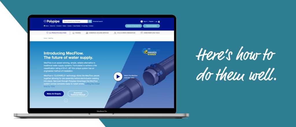
Landing pages cover everything from direct sales to mailing list opt-ins, webinar sign-ups and upsells. Here’s how to do them well.
While there are a huge range of different types of landing page, they all share one common objective: getting the ‘yes’.
So ultimately, a landing page shouldn’t be judged on how well it represents your brand or whether it contains what you think are your key messages. The only thing that matters about a landing page is its conversion rate.
Every decision should be made with that single metric in mind.
“Will this design drive more sign-ups?”
“Will this copy push our prospects closer towards converting?”
Control the controllables
Away from the copy and design, several other factors affect a landing page’s conversion rate. These include:
- How good is the quality of the product?
- How appealing is the offer?
- How well matched is your mailing list to your message?
- How precisely targeted are any traffic-generating ads?
But some of these may be outside of your control. What is in your control is the design and messaging you use to build a landing page that maximises your chances of getting the yes.
Three things to get right in your next landing page
1. Understand your audience’s current state
Every buyer goes through a journey. In their very earliest stages, they might have a problem that your product would address — but they haven’t yet even realised they have a problem. So your landing page must do lots of work taking your reader from an initial position of ignorance through to awareness, interest, excitement and finally a conversion.
At the other end of the spectrum, your audience may have identified their problem, researched potential solutions and finally decided that your product is the one for them. In this case, your landing page can almost disregard educating the reader and focus entirely on the conversion.
Knowing where your audience is on its buying journey will give you a key insight into shaping an effective landing page that speaks directly to your reader’s current situation.
2. Research your audience’s concerns
Getting a conversion isn’t about telling your reader why your product is so good. It’s about understanding the conversation already happening in your reader’s head, joining it, and then explaining why your product is the answer they’re looking for.
So tools like surveys, polls, user testing and even one-to-one interviews are all essential in providing the quantitative data you need to best match your message to your prospects’ emotions.
This is known as voice-of-customer data. And yes, there are ways to do this even if you don’t have an existing audience.
Collect strong voice-of-customer data, and your readers will feel as though you know them intimately. That’s because your copy will directly reflect back the issues and concerns already bouncing around inside their head.
You start to look like a mind-reader, and the empathy, goodwill and emotional connection builds from there.
3. Use page layouts and copy frameworks that are proven to work
Traditional copy frameworks like AIDA (attention, interest, desire, action) and PASO (pain, agitation, solution, offer) have been around for decades for one reason: they work.
Do some research into how best to structure your copy and what successful landing pages look like (remembering to pay particular attention to landing pages that are targeting an audience at the same state of awareness as yours). You’ll soon find some common elements.
If you’re still not sure, or you’d like to get input from marketers with proven expertise, talk to us. We’re a friendly bunch and we’ll listen more than we talk – promise!
