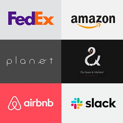
Logos We Love!
What is a logo? A name, initials, personality or a subtle message? Well, as our creative team know, it’s all these things and much more…
At the core of every successful company, is a logo and a brand that speaks volumes, it should be versatile and stand the test of time.
Not hitting a creative block and considering all possibilities of a brand is a hard skill to craft. Delving into a designer’s brain, our senior creative team share their two favourite logos:
Cheryl McMillan – Creative Director
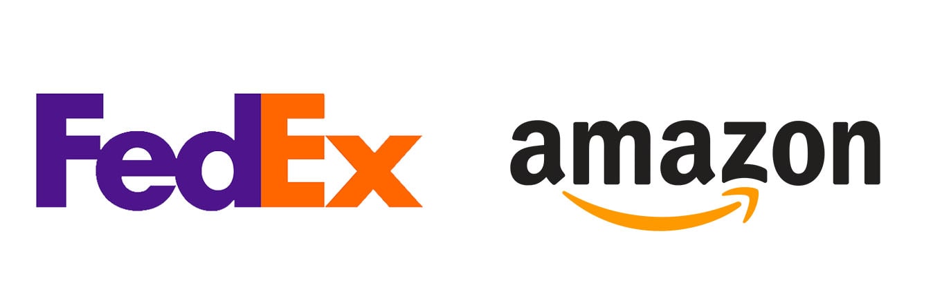
FedEx
Love a simplistic style of design that conveys a thoughtful message, I’m always attracted to logos that reflect this and have great impact. In particular, the FedEx logo has stood the test of time. Lovely use of negative space to get across a hidden message. Simple, bold. Great use of two eye-catching colours that convey friendliness and reliability. One I remember from university days…
Amazon
Another lovely hidden message in the placement of the arrow between the ‘A to Z’. The logo uses simple colours that allow it to work across a huge variety of channels. In recent years the arrow has evolved to act as a smile on their fun animated adverts.#
Marcus Barretto – Digital and Design Director
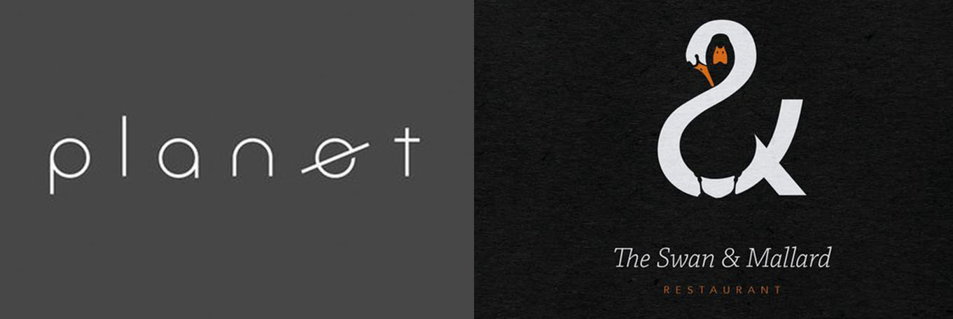
Planet
I love logos like this, not only because I’m a bit of a geek when it comes to anything space related, but it combines with my other great love, minimalist design. The subtle manipulation of a single letter to create an instantly recognisable mark, is really nimble and inventive. The ‘e’ can also be used as a stand-alone mark to summarise the brand, when the full logo isn’t needed.
The Swan and Mallard Restaurant
I’m still not sure if this is a real restaurant or not but I like to think it is, and that it’s full of creatives deciding what to eat from the beautifully letter pressed menu. I like the contrasting use of positive and negative space to create the swan and the mallard with the flash of orange boldly helping them to stand out individually. Having the swan form the ampersand is the cherry on a very considered cake.
Alex Ashman – Senior Designer
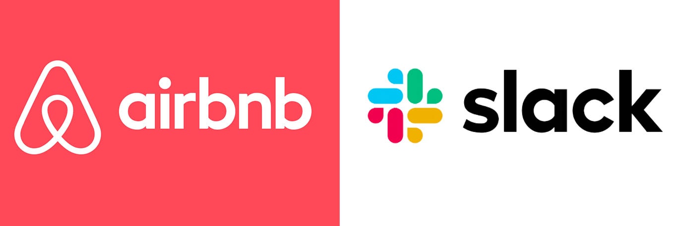
Air BnB
They totally redesigned their old logo to create a simple, clean and super versatile new identity, which was specifically built to be used over many different mediums. It works well over video, animation, web, embroidery and even as keyrings. It’s designed to be drawn by anyone and has a real DIY feel.
I love that they made their own shape called a ‘Belo’. This was created to embody the sense of belonging, as well as creating a universal symbol of Home, which is what they’ve built their whole brand around. It’s a lovely ethos and a brand that has gone from strength to strength because of this huge identity shift.
Slack
A controversial choice, as many creatives have been very vocal about how much they dislike this new redesign. I personally think the redesign is a real improvement from the last logo they had. The previous hash symbol was made up of 11 different colours and didn’t work well over other colours, imagery or on physical products. It was inconsistent and didn’t work well at a small size.
The new logo still shows the traditional hashtag shape, but now incorporates the idea of conversations and works across different mediums in a much stronger way. It’s more cohesive, modern and consistent, and I like it!
Need some help on a related project?
Related Blogs