Website Trends & Best Practice Tips

Your website is your shop window so creating an engaging experience whilst also communicating important information is crucial.
After launching our own new website, we wanted to share some of our tried and tested best practice tips.
Video
Motion is a crucial part of storytelling and user’s demand for video content continues to increase. Website users have incredibly short attention spans so video can be used to create engaging experiences whilst also communicating information much quicker.
Videos can be used to explain potentially complex information in an easily digestible format like the video we’ve created explaining the benefits of animation:

Micro Animations
The clue is in the name, micro animations are just small animations, but they can have a big impact on your website’s usability.
Micro animations can be used to great effect to guide users through your website by providing visual cues and prompts.
Minimalist or Flat Design
Minimalist design is often referred to as ‘flat design’, this isn’t a new trend but has increased in popularity over recent years. There are a number of key characteristics of flat design:
No Effects: Flat design uses a two-dimensional style that is totally flat, there are no added effects such as shadows or gradients which are traditionally used to add depth.
Simplicity: Elements used in website design such as buttons and icons are displayed using simple shapes making them easy for users to interact with.
Typography: Due to the nature of flat design, typography is crucial to add visual interest.
Colour: This is one of the most important features of flat design and the colour palettes used are often much brighter and more colourful.

User Friendly Mobile Design
Creating a responsive website which adjusts to the size of a user’s screen isn’t an option anymore and an intuitive user experience should be provided on all devices.
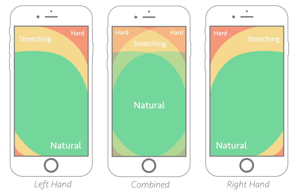
Thumb Friendly? Most users on a mobile phone will browse using their thumb to scroll through pages and click on links. Navigation menus, links and buttons should be placed in positions which are easily accessible and sized appropriately.
This helpful graphic shows the thumb-friendly areas of a mobile phone screen:
Content
The design or look of a website needs good content to help it thrive, which is why the text used on a website is one of the most important factors.
Make it easy to read: Chunking is the presentation of written content into small pieces of information. Website users will often scan written text to try and find information they are looking for so effectively chunking your content into easily digestible sections with clear headings will help users to scan your content more quickly.
Keep it simple! Content on your website should be kept informal and easy to understand whilst avoiding industry jargon users may not understand. Users are more likely to engage with friendly, informal words than overly corporate language.
A picture is worth a thousand words: Studies have shown we remember only 20% of what we read but around 80% of we see. Using images to supplement written text, infographics to explain information graphically or video and animations to show rather than tell can all help to improve content engagement.

Performance
The speed of your website should be regularly analysed and reviewed to ensure your site loads as quickly as possible.
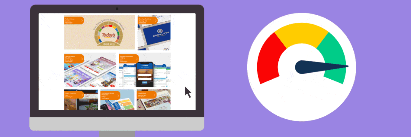
Check your load speeds: Google provide this free tool allowing you to test the speed of each page on your website. It will also provide recommendations and advice to improve the speed of each page on both mobile and desktop.
Optimise your image sizes: Images with large file sizes are one of the biggest culprits for slow loading webpages, often images aren’t compressed or resized before they are added to a webpage.
‘Lossless’* compression is the process of reducing the file size of an image without any quality loss by removing unnecessary meta data from the image.
*‘Lossless’ image compression can reduce the size of images by around 20% – 80%!
Optimise your websites code: Minification is the process of removing all unnecessary characters in the code which powers a website such as spaces and line breaks. This reduces the overall length of the code to help improve load speeds.